
How could an interactive Visit Enschede App look like?
Defining and testing the information architecture and interactive features for an interactive Visit Enschede App to increase user engagement
Master's Individual Project
Course
Concepts, Measures, Methods
10 weeks
Summary
The aim of this project is to enhance the way that new inhabitants and local tourists can engage with information from the visit Enschede app on their smartphones. The current visit Enschede website only offers limited interaction possibilities with the user via search function and links to further websites. Using the existing branding and information, an interactive and personalizable app is created and tested. The user research focuses on information architecture and interactive features.
Main methods: card sorting, focus groups, usability testing
Making information accessible and engaging through digital media plays an important role in tourist's decision making.
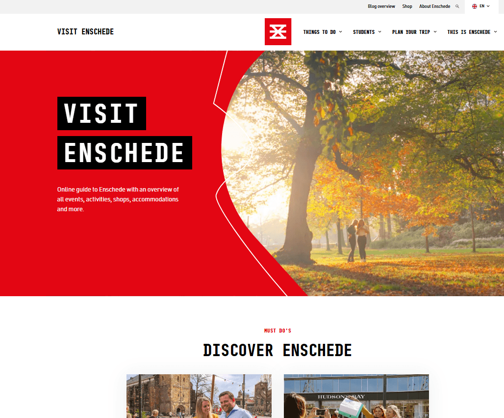
The Visit Enschede information website currently is not mobile friendly and offers limited interaction features.

Local tourism apps can enhance the user's engagement and loyalty through personalization of content.
An online survey with 17 students confirmed this: 100% of respondents would like to customize information when looking up city information.
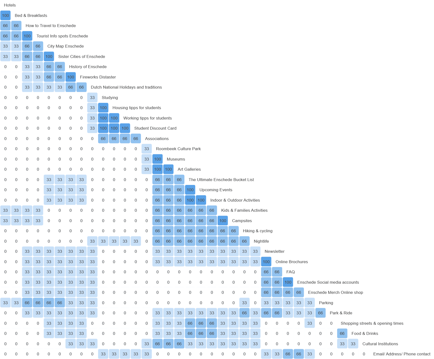
To account for the smaller screen size a card sort was conducted to restructure the content into fewer main menu items. Based on the analysis four key menu items were formed:
About Enschede
Explore
Students
FAQ/Contact

Two 1.5h focus groups with each 5 participants were conducted to collectively ideate useful interactive features.
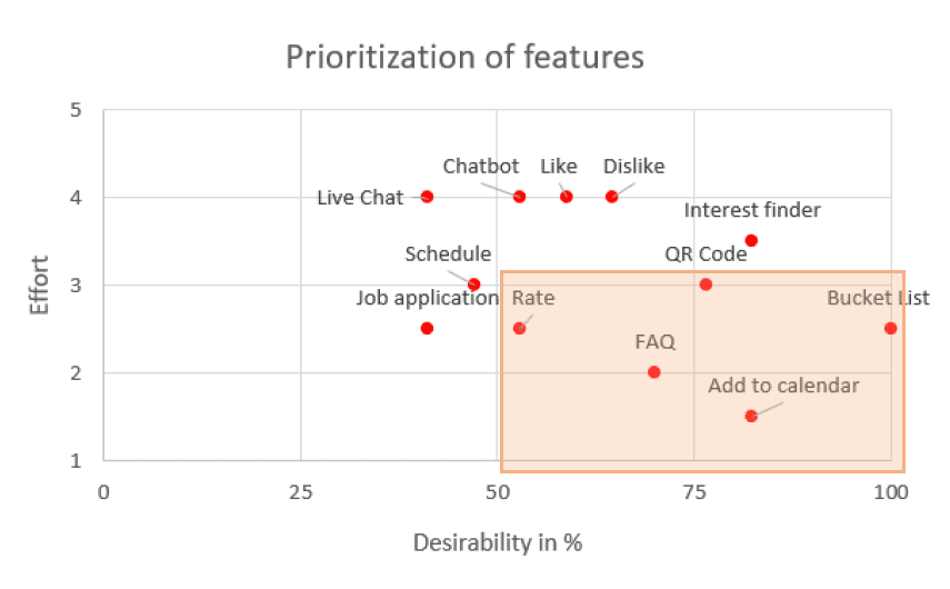
23 interactive features were ideated and 17 were taken further by the participants.
An online survey was conducted to determine the desirability of each feature. The results were used to inform the effort/desirability matrix. Five features were prioritized:
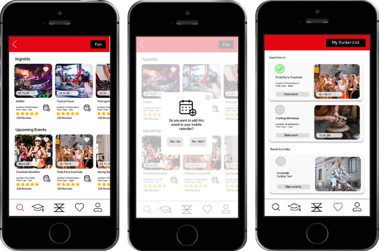
Rating Activities
FAQ
Saving Activities
Accessing Student Discount Card
Add events to calendar
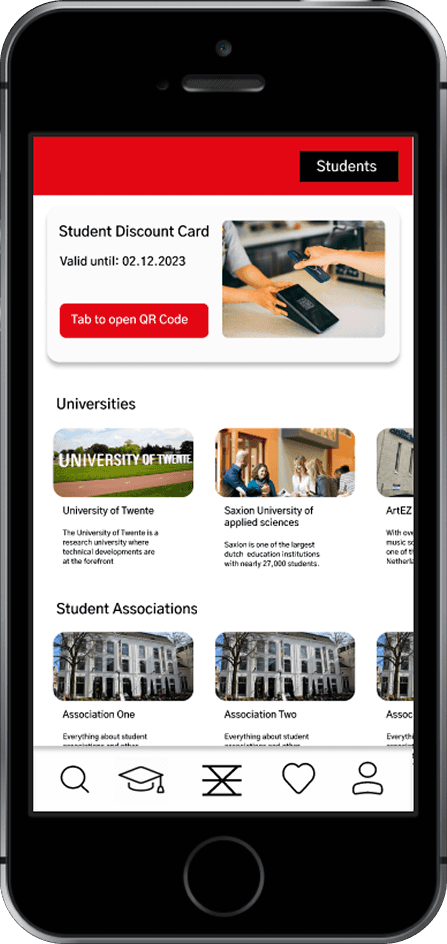
The UI prototype designed in Figma incorporated the information architecture and the five defined interactive features.
This allows to test both aspects with the target user in order to understand if the features are
The prototype was tested in a think-aloud usability test with 2 participants. The completion rate of the ten tasks was 100%.
Nine minor usability issues regarding UI design and information architecture could be identified through observation and user comments which can be taken for further improvements.

Reflection and Learnings
This project was very valuable for me to get first hand experience with conducting focus groups and card sorting. Due to the many methods involved the card sort and usability test had very limited participants which made defining a sensible information architecture difficult. In a client project these steps would take many more participants.
Additionally, I am grateful to have experienced leading two focus groups and understanding how much preparation it takes and to learn how to guide the groups depending on their specific group constellation and atmosphere.